How we use Crypticorn’s AI Prediction Dashboard
We start from Crypticorn’s Prediction Dashboard when we want a structured read on trend and volatility before we size a trade. If you are newer to price action, skim our crypto trading basics first—this guide assumes you already know what a candle and a trend mean.

Fear and Greed index: a sentiment checkpoint
The Crypto Fear & Greed Index summarizes how traders are positioning emotionally. Fear usually shows up when people worry about lower prices; greed shows up when they chase upside. Scores run from 0 (very fearful) to 100 (very greedy). We treat it as context, not a trade signal by itself.
Coin coverage: what the model was trained on
The trained-coin list tells you which markets the model actually sees often. If your token is not on the list, we assume predictions are weaker until we validate them manually.

AI 1.4 vs. 1.5: how we pick a version
- AI 1.4: Faster refresh, built for short holding periods (minutes to roughly half an hour). We reserve it for active sessions, not for beginners.
- AI 1.5: Slower refresh, steadier distributions for swings measured in hours to weeks. This is our default when we onboard new traders.
Choosing a coin and reading the chart
Select the market first, then align the AI version with how long you plan to hold. If you are still calibrating size and stops, stay on 1.5 until the workflow feels boring.
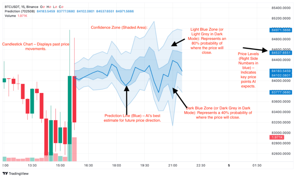
Blue line: Our best point estimate for where price settles relative to the prediction window.
Light blue / gray band (wide): The highest-probability zone for the close—think of it as the outer ring on a target.
Dark blue / dark gray band (narrow): A lower-probability pocket; fills here often come with noisier wicks outside the band.
Outer boundaries: Tails of the distribution—possible under stress, not where we anchor size.

Mentally, we picture a target: the wide band is the outer ring you expect to hit most often, the narrow band is a tighter alternative scenario, and the blue line is the bullseye.

How we spot a trade idea (example: bullish vs. bearish bias)
The notes below follow the ZEC example we keep in the product screenshots—translate the same logic to your pair.
- Bullish read: If price rides inside the wide probability band, we watch long entries on supportive reactions inside that range.
- Bearish read: If the model tilts down, we only look for shorts while price remains below or inside the most probable zone; wasted bounces near the top of the band are the usual invalidation points.
Case study: AI 1.4 vs. 1.5 on one setup

AI 1.4 showed a wider gap between the suggested take-profit line and stop line—useful when we expected a volatile squeeze. AI 1.5 later compressed that band as the path shifted to a slower grind higher. We started execution on the 1.4 read, then reappraised stops when 1.5 stabilized.

After the update, the median path pointed toward a contained drift higher between roughly $31.86 and $32.35—still not a guarantee, but a cleaner risk frame than the earlier wide scenario.
Sanity-checking predictions against the live tape
We compare the dashboard to the actual exchange chart—KuCoin in our desk workflow, but any venue works. In the example above, the dip-and-recover shape matched what we saw on the candles; that is the standard we want before we trust newer pairs.

Final takeaway
The dashboard gives us a structured prior on trend and volatility; it does not replace sizing, stops, or exchange-specific liquidity checks. Use the probability bands to frame risk, then keep a small default risk per trade (for example 1% of equity if that matches your plan) so a wrong distribution does not erase the account.
Authors: Bl0ckChainRonin and Mr. A, both active traders.


